Indicator Node
|
|
Inputs
|
Outputs
|
| Version Introduced 2.1 |

The Indicator Node is a UI Node that places a simple value indicator on the controller. It can be thought of as like an indicator light on a control panel. Its colour and the way that it displays its input signal can be changed.
Indicators have two states - active and inactive, entered as the input signal changes.
Slider Nodes were introduced in firmware version 2.4-b2.
Inputs
An Indicator has a single input port - signal. This input port will consume any values, but is mostly designed to work with values between 0 and 1. The indicator drawn to the controller will transition from its inactive colour to its active colour as the value moves from 0 to 1 by default (using Display Mode direct), or will instantly transition (like a light switching on and off) as the value crosses the 0.5 boundary if Display Mode has been set to binary.
Settings
The Indicator Node's settings can be configured to alter its visual presentation on the controller.
As a UI Node, the Indicator Node possesses the UI Transform and Background Colour settings. All UI Nodes draw to a region on the controller - this is an area that will be populated by the Indicator Node's display elements.
- UI Transform: Configures the position of this Indicator Node's UI element within the controller. The Position x and y values control the position of the center of this element on the controller, from the bottom left (i.e. x and y values of 0 result in its center being in the bottom left, x and y values of 1 result in its center being in the top right). The Scale x and y values control the width and height of this Indicator Node's UI element, relative to the controller's width and height. Scaling occurs from the center of the Indicator.
- Background Colour: Configures the background colour of this Indicator Node's UI region when it is drawn to the controller.
- Active Colour: Configures the active colour of this indicator.
- Inactive Colour: Configures the inactive colour of this indicator.
- Label Visibility: Configures whether and what the label will display. See Label Visibilities below for more information.
- Custom Label: Configures the custom label to display in modes where the label is visible.
- Display Mode: Configures whether this Indicator transitions between inactive and active states smoothly between a signal of 0 and 1 (direct), or instantly as the input signal crosses the 0.5 value threshold (binary).
Label Visibilities
A label can be added to the Indicator that will be displayed on the right of the indicator's UI element on the controller. When the label is disabled the indicator takes up it's entire area, however when it is enabled, the indicator itself will be shrunk to a square in the leftmost-side of its UI area and to the right label text will be displayed. This is all controlled via the Label Visibility setting, which can have one of the below values:
- none: The label is disabled and not displayed, the indicator takes up the entire UI space on the controller.
- value: The direct value of the consumed input port signal value is displayed to two decimal points, and the Custom Label value is printed following the value and a space (this can be used for things like units, or just naming the indicator).
- custom: Only the Custom Label value is displayed to the right of the Indicator. This is useful to label your indicators when you have many of them.
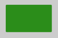
Display Mode set to none.
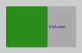
Display Mode set to value.
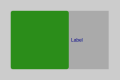
Display Mode set to custom.


