Slider Node: Difference between revisions
No edit summary |
(→Settings: Adds upper and lower value settings.) |
||
| (17 intermediate revisions by the same user not shown) | |||
| Line 1: | Line 1: | ||
{{Node Data}} | {{Return to nodes}}{{Node Data | ||
|title=Slider Node | |||
|gallery=<gallery mode="slideshow"> | |||
File:Slider-node.png | |||
File:Slider-settings.png | |||
</gallery> | |||
|output-list=<li>signal</li> | |||
}} | |||
The Slider Node is a UI Node that places a slider on the [[The Controller|controller]]. A slider is a simple element that can can be dragged in one direction - either up and down or left and right. | |||
Slider Nodes were introduced in [[Firmware Releases|firmware version]] 2.1 along with all basic nodes. | |||
The [[Example: Simple Tank-Drive Robot|Example Tank-Drive Robot]] uses a pair of sliders as it's central input method - check that out for an example nodegraph! | |||
== Outputs == | |||
A Slider Node has a single output port - ''signal''. This output port will emit the position of the slider, from 0 to 1 (clipped), every time the slider is moved when in the [[The Controller|controller]]. | |||
== Settings == | |||
The Slider Node's settings can be configured to alter its visual presentation, mode of operation and output value mapping. | |||
{{UI_Node_Settings|node=Slider}} | |||
* '''Stick Colour''': Configures the colour of the stick of this slider as it's seen in the [[The Controller|controller]]. | |||
* '''Render Orientation''': Configures the direction the slider will render - ''vertical'' will result in a stick that can move up and down within its region, while ''horizontal'' will draw a stick that can move left and right. | |||
* '''Release Behaviour''': Configures what should happen to the slider when a held click or touch is released - ''reset'' will result in the slider returning to its ''Start Position'' when released - much like a spring-loaded self-centering joystick on a traditional physical controller, while ''hold'' will leave the Slider in its current position, similar to non-self-centering joysticks. Sliders set to ''hold'' will render with three little bars in the center of the slider perpendicular to the direction of movement allowed (you can think of them as gear teeth, meshing into some unseen rack to stop the slider from moving back on its own). | |||
* '''Start Position''': This configures both the position the slider starts in and the position that it returns to if its ''Release Behaviour'' is set to ''reset''. | |||
* '''Invert Output''': This option inverts the output. By default a fully downward position makes the output ''Signal'' port emit '''0''', and a fully upwards emits '''1''', however enabling this inverts that, with a fully downward slider position emitting '''1''' and a fully upward position emitting '''0'''. Note that similar achievement could be achieved by using an [[Inverter Node]] on the ''signal'' output port. | |||
* '''Upper Value''': ''[Added in version 2.4-b5]'' The value this slider will output at it's maximum position, defaults to '''1'''. | |||
* '''Lower Value''': ''[Added in version 2.4-b5]'' The value this slider will output at it's minimum position, defaults to '''0'''. | |||
== Gallery == | |||
<gallery mode="slideshow"> | |||
File:Default Controller 2023-02-25.png|Two sliders are present in the default nodegraph configuration. Both of these sliders are in ''reset'' mode and their sticks will ping back to the center once released. | |||
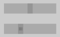
File:Slider-vertical-reset-and-hold-UI.png|Two sliders in the ''vertical'' orientation, the left set to ''reset'' mode and the right set to ''hold'' mode. | |||
File:Slider-horizontal-reset-and-hold-UI.png|Two sliders in the ''horizontal'' orientation. The upper is set to ''reset'' mode, with the lower set to ''hold''. | |||
</gallery> | |||
Latest revision as of 15:02, 14 September 2024
|
|
Inputs
|
Outputs
|
| Version Introduced 2.1 |


The Slider Node is a UI Node that places a slider on the controller. A slider is a simple element that can can be dragged in one direction - either up and down or left and right.
Slider Nodes were introduced in firmware version 2.1 along with all basic nodes.
The Example Tank-Drive Robot uses a pair of sliders as it's central input method - check that out for an example nodegraph!
Outputs
A Slider Node has a single output port - signal. This output port will emit the position of the slider, from 0 to 1 (clipped), every time the slider is moved when in the controller.
Settings
The Slider Node's settings can be configured to alter its visual presentation, mode of operation and output value mapping.
As a UI Node, the Slider Node possesses the UI Transform and Background Colour settings. All UI Nodes draw to a region on the controller - this is an area that will be populated by the Slider Node's display elements.
- UI Transform: Configures the position of this Slider Node's UI element within the controller. The Position x and y values control the position of the center of this element on the controller, from the bottom left (i.e. x and y values of 0 result in its center being in the bottom left, x and y values of 1 result in its center being in the top right). The Scale x and y values control the width and height of this Slider Node's UI element, relative to the controller's width and height. Scaling occurs from the center of the Slider.
- Background Colour: Configures the background colour of this Slider Node's UI region when it is drawn to the controller.
- Stick Colour: Configures the colour of the stick of this slider as it's seen in the controller.
- Render Orientation: Configures the direction the slider will render - vertical will result in a stick that can move up and down within its region, while horizontal will draw a stick that can move left and right.
- Release Behaviour: Configures what should happen to the slider when a held click or touch is released - reset will result in the slider returning to its Start Position when released - much like a spring-loaded self-centering joystick on a traditional physical controller, while hold will leave the Slider in its current position, similar to non-self-centering joysticks. Sliders set to hold will render with three little bars in the center of the slider perpendicular to the direction of movement allowed (you can think of them as gear teeth, meshing into some unseen rack to stop the slider from moving back on its own).
- Start Position: This configures both the position the slider starts in and the position that it returns to if its Release Behaviour is set to reset.
- Invert Output: This option inverts the output. By default a fully downward position makes the output Signal port emit 0, and a fully upwards emits 1, however enabling this inverts that, with a fully downward slider position emitting 1 and a fully upward position emitting 0. Note that similar achievement could be achieved by using an Inverter Node on the signal output port.
- Upper Value: [Added in version 2.4-b5] The value this slider will output at it's maximum position, defaults to 1.
- Lower Value: [Added in version 2.4-b5] The value this slider will output at it's minimum position, defaults to 0.
Gallery
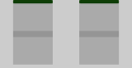
Two sliders are present in the default nodegraph configuration. Both of these sliders are in reset mode and their sticks will ping back to the center once released.
Two sliders in the vertical orientation, the left set to reset mode and the right set to hold mode.
Two sliders in the horizontal orientation. The upper is set to reset mode, with the lower set to hold.


